
Art Museum Case Study
UX Design and research by Chloe Flanders
First case study for the Google UX Design Certificate program
the product:
The Canterberry Art Museum app allows users to search and save the museum’s collection for artworks and artists. In order to increase interest in the museum while keeping CDC guidelines at the forefront, the app is for users to virtually and remotely interact with exhibits.
project duration:
November 2021- January 2022
my role:
UX designer, researcher
responsibilities:
User research
Wireframing
Prototyping
Visual Design
tools used:
figma
photoshop
The goal:
Create an app for users to interact with the
museum remotely.
The problem:
The Canterberry Art Museum is not currently
accessible to all patrons and is lacking visitors.
The goal of my user research was to determine who exactly was going to the museum. I conducted a survey to get a better understanding of who held or did not hold an interest in the museum. According the survey, many users were very interested in the museum, but outside factors prevented them from being able to go. Further research concluded this was especially true for lower income individuals and those choosing to stay home due to COVID-19.
user pain points
Time
Patrons were often busy with jobs and other obligations
Money
Patrons with less financial stability would rather save their money for living expenses
Accessibility
Many patrons were older and considered at risk to COVID-19. In addition, some had limited sight
persona
Izzy is an 8th grader from Chicago who wants to visit the art history museum outside of school field trips. She is doing an extra credit project based on any piece of work she finds in the museum. Izzy’s mom works long hours and doesn’t normally have time to go with Izzy to the museum and feels uncomfortable letting her go on her own. Izzy gets a weekly allowance, but doesn’t have enough money to buy tickets for admittance.
Age: 13
Education: Middle school
Hometown: Chicago, IL
Family: Mother
Occupation: Student
Goals:
Complete her extra credit assignment on art history
Frustrations:
Can’t go to the museum without guardianship
Does not have enough money to purchase tickets
problem statement:
Izzy is an 8th grade student who needs to go to the art museum without the guidance of her usually busy mother because she needs to complete her extra credit assignment.

Iterations of the home screen wireframes
I wanted the user to feel connected with the museum, even though they most likely weren’t physically there, so I included sections for exhibitions and feature articles on the home page, which I explored in the first set of paper wireframes.

I also mapped out a general idea of the user flow, with the goal of the user saving information
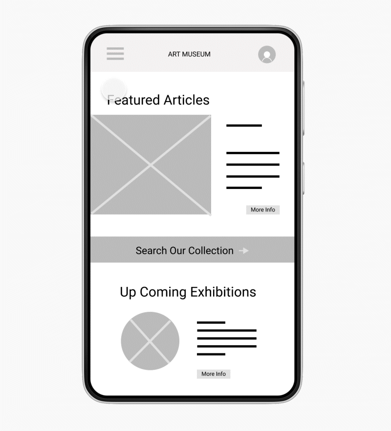
After digitizing the paper wireframes, I was able to better understanding of how the app should be formatted. Since the main user goal is to search and save information, I added a search button to the homepage instead of going through the navigation menu
I found in my usability studies that users wanted:
Better cues
Page descriptions
To find information quickly
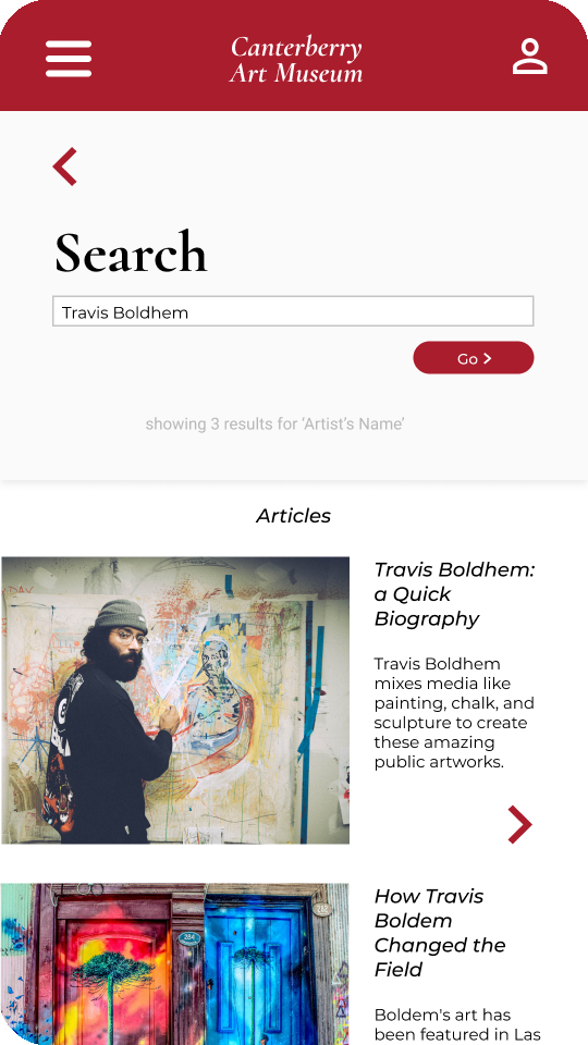
Larger buttons


After usability studies, I moved the search our collection button to the top of the page, since that is the primary action users will be taking. I also made the image associated with the articles clickable since users found that more convenient.
I also increased the size of the header text as well as the top image in order to be easier to see. I also added a text to speech button for accessibility purposes.
Click here to view the hi-fi prototype


Accessibility Considerations
Contrasting colors
Text to speech
Large buttons
What I learned:
From the beginning of the design process, the user is always kept in mind (after all, it is user-centered design). When you begin conducting usability studies, you really get to connect with users through your app and learn what does and doesn’t work for specific individuals.
Thank You!
Thank you for reviewing my work for the Canterberry Art Museum app


